Case study · Restaurant · Reservations
Restoran Vinogradi.
A digital restaurant experience with an interactive menu and a centralised reservation flow designed for mobile visitors.
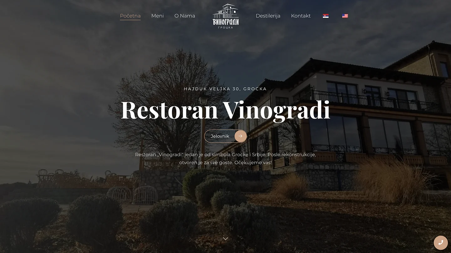
Homepage. Address, menu and atmosphere before the guest thinks of calling.
Project overview
Restaurant visitors mostly arrive from a phone and want three answers quickly: what the place feels like, what is on the menu and how to reserve.
We created a warm visual presentation with a mobile-friendly menu and reservation access exactly where it is needed.
Reservations became part of the website instead of a separate phone process, creating a cleaner booking flow during periods of high demand.
Challenge
Restaurant visitors mostly arrive from a phone and want three answers quickly: what the place feels like, what is on the menu and how to reserve. Extra steps increase drop-off.
Solution
We created a warm visual presentation with a mobile-friendly menu and reservation access exactly where it is needed.
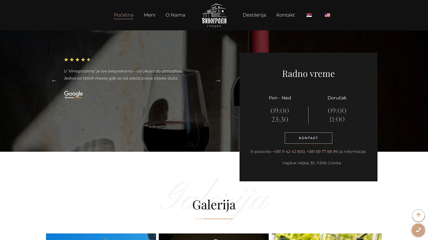
A review and opening hours in one block, phone as the next step.
The system behind the website
Reservation requests are collected in a structured flow rather than scattered across calls and messages.
From appetite to reservation
The path is intentionally short: atmosphere, menu, location and reservation. The menu is interactive content rather than a PDF that has to be pinched and zoomed.
Menu and bookings without manual clutter
A central reservation flow makes peak periods easier to manage because requests are collected consistently instead of arriving across several disconnected channels.
Why it matters
For a restaurant, the mobile journey matters most: check the menu, confirm the location and book. The fewer steps between those actions, the better.
Have a project of this kind?
Tell us the goal and the constraint. You get a written proposal with a defined scope, not a guess.